
A website with a good contact page shows that the business behind the website is serious about customer service. This make brands stand out and builds reliability. Here are a few tips for a great contact page;
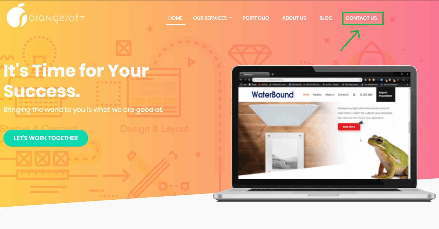
Help users find the page
Every good website uses intuitive design to allow users to easily navigate through the website. This helps them navigate to the content they would likely want to see first. Using this same principle, you’ll allow users to easily find the contact page. Keep in mind that users would sometimes go there when they have a problem, making the process easy for them early on would definitely help them feel better.
Put common wordings like "Contact us" or "Support" to your header or make call to actions buttons.
Make it personal
Putting up a photo of a person in the background of your contact page helps more than you know. Research shows having other people around tends to create more cooperative behaviours (even just a poster of a face has that effect). Don’t just put up any random person or worse yet use stock photo. Choose a photo that would be relatable to your audience.
You can also just incorporate a little bit of humor or your message that you want to communicate to your website visitors.

Simplify it for them
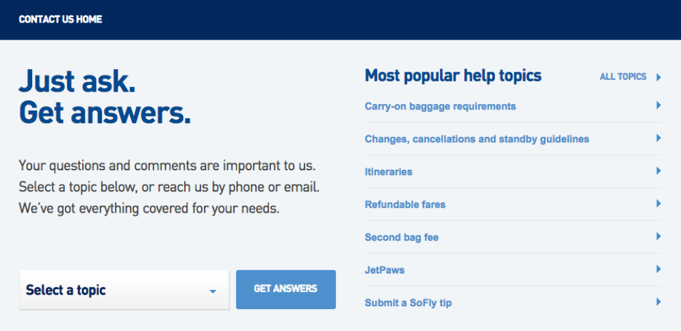
Lucky for you, most problems and questions aren’t unique to one person. More often, there are a huge number of users asking the same questions. This is where FAQ’s help a lot. Categorise questions or topics that are commonly discussed among your users. This helps them to find the answers they need immediately without having to wait.
Also, you can display an e-mail address for them to contact you with. Make sure it is clear and obvious for them to notice. You could also provide your audience the option to chat with a customer service personnel live.
Make it clear and interesting
Don't overcomplicate things. If you decide to use a submission form, make sure that people will know how to fill all parts of it. Avoid using too many fields as it may cause that the person will not write proper answers.
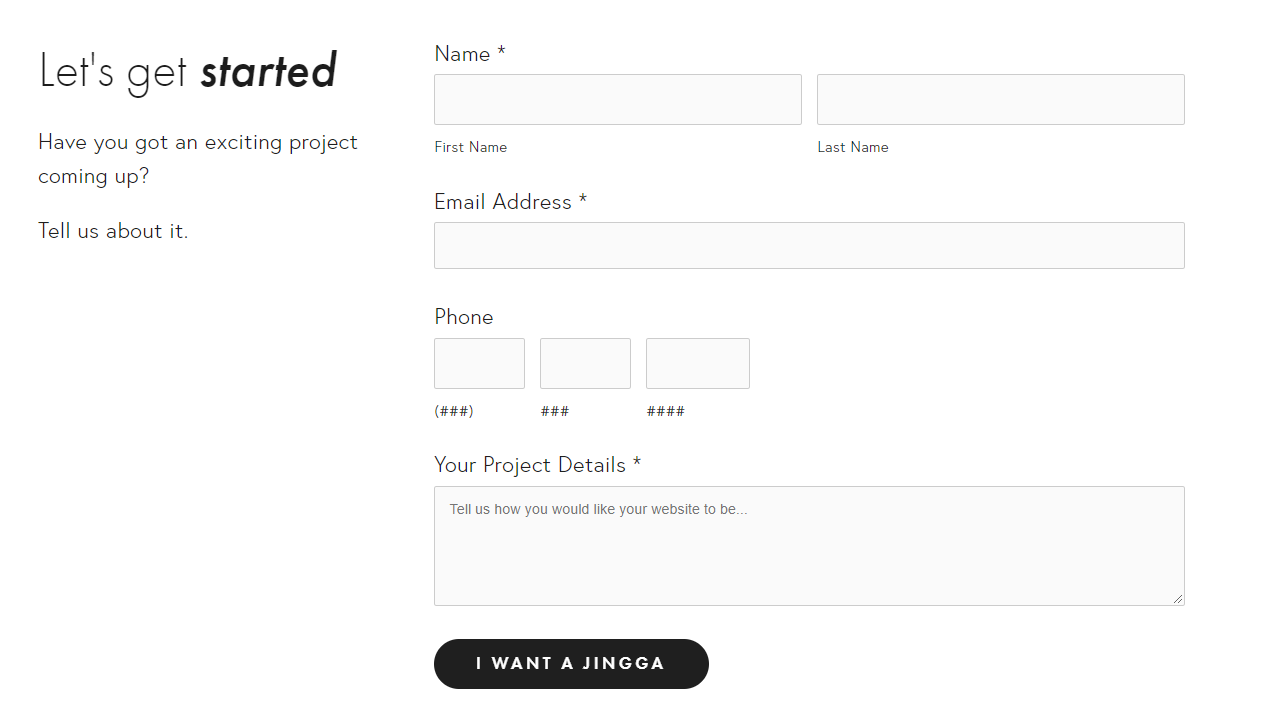
You also don't fill the contact page with unnecessary information. Having a contact information, map and location to seem more reliable, social media links and a submission form is many times more then enough.
Make sure that your contact page is easy to find, relatable, and convenient for your users. The easier it is for them to resolve issues, the better your reputation is among them. Need help with your website? Let’s chat!